13 February 2017
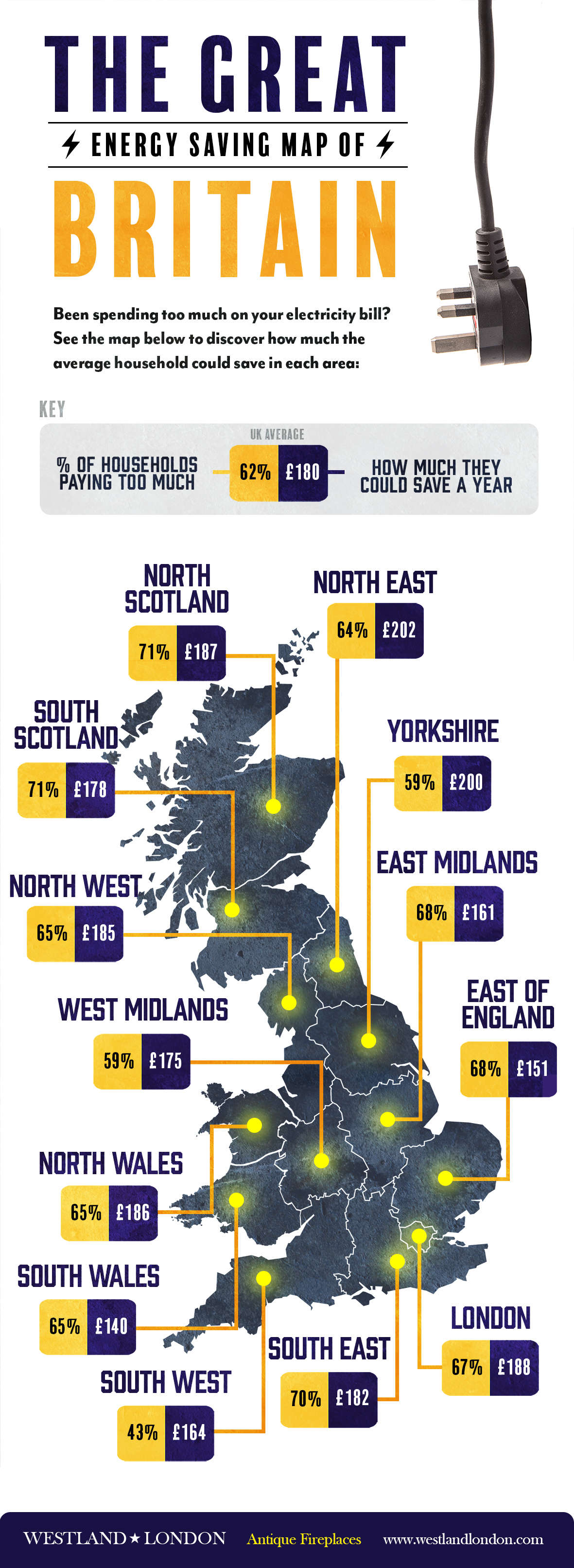
We surveyed 2000 people and discovered that huge numbers of people aren't getting the best deal on their energy.
Only 38% make the effort to shop around on comparison sites to find the best rate, while the remaining majority endured an average loss of £180 per household, per year, which went up to an average of over £200 in areas such as the North East and Yorkshire. That means that the majority of people in the UK are paying almost 20% more on gas and electricity than they need to.
See below for more:
Share This Infographic On Your Site
For more about Westland's antiques you can browse their antique fireplaces, antique sculptures and more here.